Reading a frame for colour
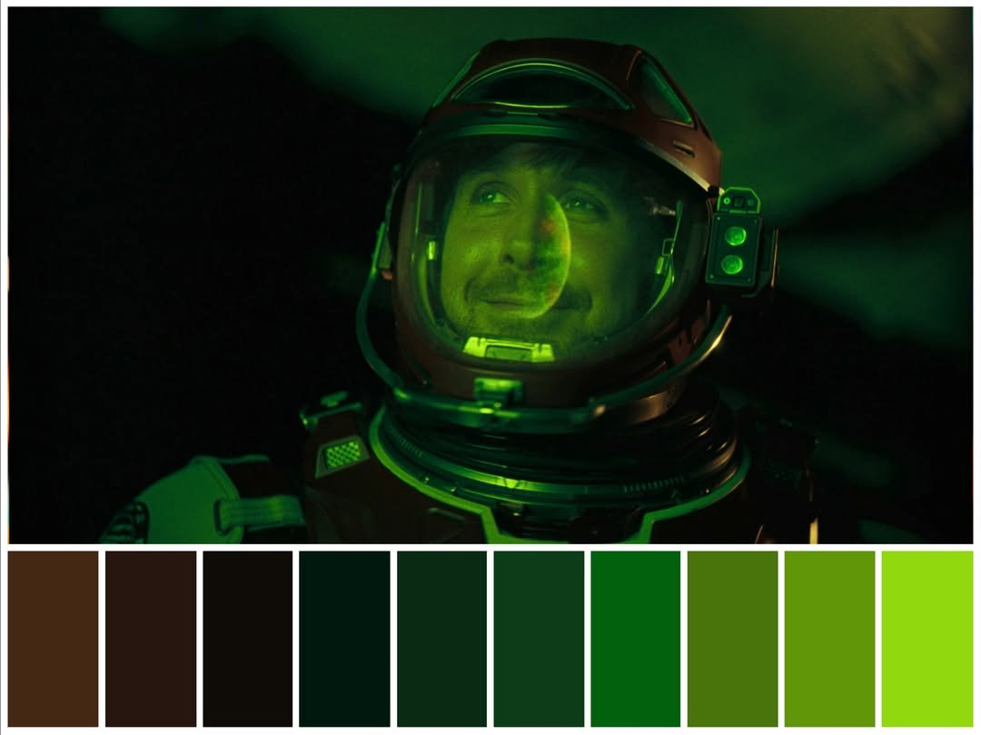
A still already carries a palette — the work is deciding which six samples speak for it. Four habits get you a strip that looks like the film instead of a screenshot of noise.
Start from the extremes
Sample the brightest light and the deepest shadow first — they set the range every other band has to live in.
Take mid-tones from objects
Skin, walls, fabric and metal carry the grade. Sky, fog and glass usually collapse into one flat band.
Allow exactly one loud colour
A neon sign, a red coat, a tail light. Two saturated bands next to each other fight; one reads as an accent.
Skip letterboxing and subtitles
Black bars and white captions are not part of the film’s palette, and they each cost a slot.
What the download actually is
One PNG holding the frame and its strip, sized so it still looks sharp when a platform re-compresses it or when it goes on paper.
- Size
- 3200 px wide — 2× the preview — as a PNG
- Crop
- Centre-cropped to 16:9, exactly what you see on screen
- Strip
- One band per colour, in the order the bands sit in
- Privacy
- Sampled by your browser; the image is never uploaded
Every colour is read from the pixels you clicked, so a streaming rip, a Blu-ray and a 4K remux of the same shot will give slightly different numbers. That is also why two people sampling the same film rarely land on the same six — a palette taken this way is a reading, not the negative.
Where the format comes from
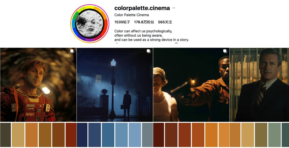
A still above, a row of bands below, nothing written on the image — that layout has become a genre of its own on Instagram, and @colorpalette.cinema has been posting it for years, one film frame at a time. This page does the same composition from a frame you bring, at export size, without opening a design app.